29/01/2016
28/01/2016
Extended Practice Saul Bass Contextual Research

I've also been looking at a lot of Saul Bass' work in regards to the secret 7" brief, I really like the bold graphic shapes in his work and I feel that this is something I want to incorporate into my work for this brief.
Extended Practice Noma Bar Contextual Research
I've been looking at a lot of Noma Bar work to work out how I can produce these images for my secret 7" covers, I want to keep them simple but probably nowhere near as simple as Bar's images.
Extended Practice Paper Cut Contextual Research
For the secret 7" brief I intended to do paper cut but I realised that I didn't have any research into what the final pieces could look like, I love the layered images that really gives the work a sense of depth. I want to try and keep the designs really simple in terms of colour using coloured paper without adding anything to it.
Extended Practice World Cup Posters Contextual Research
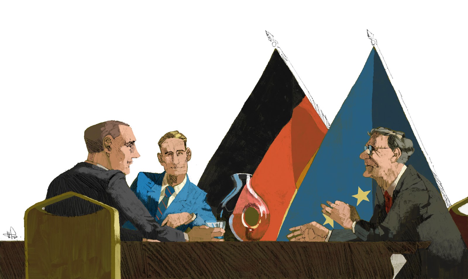
These are the world cup posters I've been looking at after seeing the 1966 poster at the football museum. I don't think any of these are as strong as the 1966 poster but it gives us a good indication of how to include some of the national identity elements by looking at how they were previously used.
Extended Practice Yann Dalon


Another illustrator I've been looking at for my poster and football program briefs is Yann Dalon, technically I think his work is phenomenal though he's not really doing anything interesting with the composition. I think the craft of the pieces are phenomenal and I really want to capture the sense of movement in my posters and programs.
Extended Practice Marc Aspinall Contextual Research

For this brief I really wanted to introduce some traditionally made textures into my work, Marc Aspinall was one of my biggest influences for the idea as I love his work and I think I've referenced him in almost every project i've done so far this year. I want to produce something similar to what he does but I also want to keep it slightly cleaner and more in line with the usual aesthetic of my work but with a slightly more retro illustration vibe.
Extended Practice Footballer Drawings


I did these three drawings to send to Matt so he can start to work out the type layout for the poster, I'm really happy with the Dele Alli (middle one) drawing, I feel the other two are also quite strong but they are much rougher than the Dele Alli one but that's fine as these are in no way intended to be the final drawings.
Extended Practice Slight Reshuffle
I had a slight reshuffle of this project a couple of days ago I decided to try and focus on younger players so for example rather than having Thomas Muller on the Germany poster I'm going to have Mario Gotze. So for all 6 posters I'm going to have...
England - Dele Alli
Wales - Gareth Bale
Germany - Mario Gotze
France - Antoine Griezmann
Spain - Alvaro Morata
Belgium - Kevin DeBrunye
I feel these players are all stars of the future and have potential to go on to be world class other than Gareth Bale who is arguably already world class but I didn't feel there was a better welsh international to go on the poster.
Extended Practice England Euro Poster

I did a drawing of John Stones for the England poster, I think this figure works really well with where the type is because the arm runs parallel with the type but this could become a problem when Matt changes the type. I updated the kit to the leaked England 2016 kit for the euros but obviously as the official kit hasn't been announced yet and likely won't be until March we'll probably be best to leave the nike teams until last.

I also did some more refined digital line work for this poster but i'm really unhappy with it and I think one of the major things that's started to happen for my practice this year is a move away from digital as much as possible, I always try and work out how I can finish the project in a traditional way rather than jumping straight onto the tablet.
Extended Practice Euro Poster Layouts


I did these to send to Matt to give him a better idea of how the figures would fit into the designs better, I think the best way for this project to move forward will be for me to do the roughs of the footballers and then send the PSD files to Matt so he can create a layout for me to rework the figures around his type.
27/01/2016
Extended Practice Initial Layout Idea

This was my initial layout for the posters that I sent to Matt to get an idea of what I was aiming for with these posters, I decided each nation will have one player on the poster. For France I decided to focus on Antoine Griezmann who currently plays for Atletico Madrid and the French national team I decided to focus on players who will be stars of the tournament. In the background I want to incorporate the graphics from the 2016 adidas ball for the poster as well which I started to do behind Griezmann. The type was heavily influenced by the 1966 world cup poster though this is rough just so we could work out where the text could go but I'll leave all the choices in regards to the text for Matt.
Extended Practice Studio Brief 10 Brief
Brief Title - UEFA Euro 2016 France Posters
Brief - For this brief I intend to produce a set of posters for different nations playing in the euros in the summer, I feel this brief would be great as it's a dream brief to receive in the real world. The text on each of these posters will be in the native language of the country featured on the posters.
Product - I will produce 6 posters each focussing on a different nation in Euro 2016 The nations I've decided to focus on are England, Wales, France, Spain, Germany and Belgium as these are the nations that I feel are most likely to succeed in the summer and are probably the most popular teams.
Tone of Voice - All the posters will have the same tone and I want them to really embody the atmosphere of the tournaments, I also want them to represent France as a country this will come from the colour scheme and text I think.
Audience - The audience will be football fans and I feel they could be included in publications such as Rabona or Soccer Bible as they both celebrate design and football culture. They will also have to have a mass appeal as they will be used as advertising for the tournament and should make the viewer want to go and watch the tournament to cheer on their team.
Context - The posters will be seen in public and would be pasted on walls around the major cities in each of the nations, The posters will need to be easily visible and stand out in the crowded cities.
Additional Notes - I'm really excited about this project, I will again be working with Matt Brewer who will do the text for the posters and I will be working on the illustrations. I want to work with traditional media to create texture for the illustrations for this project.
Deliverables - 6 Posters with each poster focussing on one nation.
Extended Practice Studio Brief 10 Idea

Extended Practice Programmes Contextual Research
These are the programmes we bought whilst we were in Manchester, All the programmes are teams that we'll be designing covers for. Although there are two that aren't but we bought them because they had very similar designs even though the programmes are from years apart. The concept Matt came up with was to have a similar design for all four programs but with different illustrations.
Extended Practice Football History Museum Research Trip
Last Tuesday me and Matt took a trip to the Football history Museum in Manchester, We found some really great contextual research and new ideas for how to move forward. Whilst in Manchester we also found some old programs for the teams we're designing covers for I'll upload them in the next post.
24/01/2016
Extended Practice Book Cover Design Contextual Research
After deciding to change my brief slightly I spent a lot of time doing more contextual research, As I'll just be producing a cover, spine and back cover for the project I decided to update my Book Design Pinterest bored from last year. The covers that I really liked were the simpler ones so I'm going to try and reflect this in my designs for the project.
Extended Practice Studio Brief 8 Brief Updated
Brief Title - Book Covers
Brief - For this brief I intend to produce a set of book covers for a wide of books, I aim to produce around five illustrations for 5 books.
Product - I will produce 5 Book covers, Spines and Back covers for a set of 5 books. I will mock up the books onto boards but also try and produce a physical mock up of the actual products as well.
Tone of Voice - Each book will differ in terms of the tone of voice, based on whats appropriate as I'm going to try and produce a set of illustrations for vastly different books so the tone will differ. The two books that I've chosen so far American Gods and A Clockwork Orange will probably be the most similar in tone.
Audience - The audience will differ from book to book again but I'm going to propose that I would produce these designs on a commission from Penguin, as the Clockwork Orange brief is a competition I'm going to mold my other covers to fit this brief and template.
Context - The context of the books would be that they would be seen in shops such as waterstones and need to have a mass market appeal but sill fit the tone of the books, The designs would also need to work on screen though as e books are becoming more and more prominent.
Additional Notes - This brief is a adaptation of two of my previous briefs that I'd written out the Clockwork orange competition brief and the American Gods competition brief, I feel that both these briefs had parts that could be successful but it was important to strip away the unnecessary parts.
Deliverables -5 Front Covers, Spines and Back Covers, to Penguin Books specifications.
Extended Practice Chvrches Clearest Blue

After listening to the songs for Secret 7" this was the one I had the clearest idea for, The song is about a relationship that is referred to as a storm throughout the song. The storm became a key motif for my cover of this song. To me the song is in two parts with the first being the calm side and then in the second half the song erupts when the synths kick in. I've tried to reflect this duality in my design by having an image that will worth both ways around, with each side representing one half of the song. I tried to keep the image fairly simple with bold shapes and I'm really looking forward to working with paper cut for this project but if it doesn't work the designs will translate well to vectors.
15/01/2016
Extended Practice Liverpool Match Day Programme

This is Liverpool's current match day programme, there's nothing wrong with this design but I just think it's very generic and dull I feel that there's real scope for us to improve on what they currently have. This gives us a good idea of what to have on the cover in terms of sponsorships and details.
Extended Practice Coutinho Programme

This is my initial idea for the Liverpool programme cover, I decided to use Coutinho as I feel he is Liverpool's most popular player at the moment and is debatably their most recognisable, I like the idea of having the circles as well but they will be much more subtle once colour has been added. All the line work will be redone this is just a rough to send to Matt so we can start to develop ideas for the covers and back covers, his initial response was to enlarge the image so it wraps around the cover more.
14/01/2016
Extended Practice Man in the High Castle Illustration Rough

I really like the composition of this image and when drawing it I tried to really consider the line of sight of the image and how it could lead the viewers eye across the image. This image would be a half page images with the top half of an article above it.
12/01/2016
Extended Practice Television Editorial Illustrations
This is a list of my initial ideas for the television editorial illustrations, I've decided to come up with article titles for the illustrations as well. I may try and get in touch with a graphic designer to help design a second page to go with the illustrations that would make the images work as spreads.
Mad Men one year on... - I'd love to do a retrospective piece on Mad Men one year after the series finale, I think there's a lot of scope for this illustration and it has such a unique look and style that I'd love to illustrate. This could be a good chance for me to really try and push my tone of voice forward and incorporate more traditional media into my work to match the tone of the show.
War and Peace Review - I think it's important for this brief to pick television shows that I wouldn't normally watch, this will allow me to illustrate something completely different to what I'd usually try and do. I think this could work really well as the series has such a unique and stylish look for a period piece.
Silicon Valley - I've held off on watching this series and i'll be going into it fairly fresh, I think this will be a great opportunity to create a piece without having any ideas about what I'm going to make going in.
The Last Man on Earth -
Daredevil Season Two -
House of Cards -
Game of Thrones returns -
11/01/2016
Extended Practice Matthew Brewer Meeting
Plan of Action
Research Trips
Meeting to Clarify Brief - 18th Jan
Liverpool Stadium Tour - 26th Jan
A good idea of the history of the club and their ethos, It'll also be a good chance to get some first hand research and source material to work from.
Manchester Football History Museum - 19th Jan
We're hoping to see some old programs to get an idea of the ethos of the clubs and see what they usually lean towards in regards to design elements that have been consistent throughout the clubs history.
Sheff Utd Game - 20th Feb
We'll get a good idea of the demographics that buy programs before a game, perhaps even interview some of the people that sell programs to get their views.
10/01/2016
Extended Practice Folio Society Contextual Research
I love the Folio society books, I'm a big fan of high end books and the Dune reissue that Folio Society did is easily one of my favourites. The interior illustrations are amazing and I love the slipcase with the minimalist design, Whats really struck me whilst looking at the Folio Society books is the diversity not just in the subjects of the books but in the styles of the illustrations. Though a lot of the images I've picked are a similar aesthetic but thats just down to personal taste.
Extended Practice New Yorker Contextual Research
This is my initial contextual research into the style on illustrations that the New Yorker uses, this board is a mix of pieces for the television show reviews and front covers. This gives me a good overview of the style of work they use and they types of colour schemes they use, I was really surprised to see that Tomer Hanuka had produced a cover for them as they usually go for illustrations with a slightly kitschier style. A New Yorker cover would be something that I'd love to do in the future and is like a dream job.
09/01/2016
Extended Practice Book Publishing Contextual Research
I found this video where Penguin Random House design studios talk about the way they work and how they approach book covers, this was really great to watch in preparation for my Folio society style illustrations for American Gods. In particular one part of the interview really stood out to me and that was when they were talking about how they should never show the characters in full as a big way the audience connect with a book is through the way they imagine the characters, This has really stuck with me and is something I definitely want to use and incorporate into my ideas from this brief. It will also force me to not be so reliant on characters and try to set the scene in a different way.
Extended Practice Studio Brief 9 Brief
Brief Title - The Last Guard Comic
Brief - This brief is to produce the first issue of a potential comic series that I have been working on with writer Ewan Moore, This is an extension of Studio Brief 2 but this time I want to produce the full comic and redo the pages that i already did for the pitch as I don't feel they are strong enough in relation to what i want to produce.
Product - The product will be a 32 page comic as well as a front and back cover, the comic will work both traditionally and digitally.
Tone of Voice - The comic is set in post apocalyptic Britain thirty years after 80% of the population disappeared, the way we've tried to make our comic unique from the other post apocalyptic comics out there is that ours is going to be quintessentially British and we really want to try and find the beauty in the British apocalypse where as many other post apocalyptic media is based in deserts we want our comic to contrast these, It's also a story about survival. This will mean I'll be looking at beautiful landscapes and vibrant colours.
Audience - he audience for our comic is 16 - 35 year olds, mainly British people but I think our version of Britain is the romanticised idea of Britain that will also appeal to an American audience. I want to keep the audience gender neutral as I feel the emerging female market of comics like Saga is a big market we could tap in to and strong female characters are a big part of the comic.
Context - I want to create a comic in a similar vein to series such as Y the Last Man and Saga by Brian K. Vaughn and Zero and Wolf by Ales Kot and Matt Taylor. The Great Salt Lake by Matt Taylor is another touchstone for the series.
Additional Notes - This brief is an extension of Studio Brief 2 and now i have more time to dedicate to this project I feel that I would be able to produce a much stronger project than I could whilst also focussing on COP.
Deliverables - A 32 page comic as well as a front and back cover.
Extended Practice Studio Brief 8 Brief
Brief Title - Folio Society American Gods
Brief - For this brief I intend to produce a set of illustrations for the book American Gods by Neil Gaiman, I will produce them in the same format as the Folio Society.
Product - The product for this brief will be a folio society style reissue for American Gods, to do this I will need to produce a slip case with foil detailing. I will also produce a book cover front and back design and also 5 interior illustrations based on scenes in the book.
Tone of Voice - For this book I want to capture the mysticism and the mystery of American Gods, The book is quite dark and I really want the illustrations to capture this. I want the illustrations to be cinematic and be heavily layered and detailed so on every viewing the reader ill notice something new.
Audience - The audience for this will be fans of the Folio society and Neil Gaiman, I think it's important for this project to really capture the high end appeal of the Folio Society reissues and make a well considered piece that wouldn't look out of place among other Folio books.
Context - The context of the illustrations will be within a book and as a cover and slipcase so it's important that they wouldn't look out of place in somewhere such as Waterstones.
Additional Notes - This brief is a revisit to one of my more succesful briefs from last year for OUIL 503 I feel that I would approach the brief very differently now so I've decided to go back to it and have another go at tackling this source material. This brief has a very different approach to last time though as instead of a television series the illustrations are for the book.
Deliverables - A slipcase cover, Front and back cover and 5 interior illustrations. The designs will be mocked up on boards.
Extended Practice Studio Brief 7 Brief
Brief Title - New Yorker Style Television Page Spreads
Brief - This brief is to produce a set of pieces based on tv shows in the same format as the ones that are used in the New Yorker, I wanted to create some editorial style work based around tv series and I realised that alot of the work I was looking at was coming from the New Yorker and I did more research and realised this was somewhere that I would love to have my work in. Each piece will be based around a different television series and would accompany an article or review. I'm going to try and keep the illustrations as relevant and current as possible.
Product - Full page spreads, that would be featured in a magazine similar to the New Yorker and they would be accompanied by an article or review.
Tone of Voice - The tone of voice will change from piece to piece depending on the television series that the pieces are based on. It's important for the pieces to capture the tone of the series that the images are based on i don't really want to just draw scenes from the programmes I want to really capture the atmosphere and ethos of the programmes.
Audience - The audience will be the New Yorker readership so I am going to do much more research into the work that they currently feature in the New Yorker and I feel that my work can work well in this format.
Context - The context will be within the New Yorker magazine accompanied by an article and the illustrations must work in print and on screen as digital magazines are becoming much more popular.
Additional Notes - This image will allow me to create a set of illustrations on a wide body of tv series, I see this as an extension of the Breaking Bad piece I did for Little White Lies last year and this just has a much better context and I feel that if I'm successful when I leave uni this somewhere that I'd love to see my work in the future.
Deliverables - A series of full page illustrations mocked up onto boards as part of the magazine.
Extended Practice Studio Brief 6 Brief
Brief Title - Secret 7"
Brief - This brief is based around the Secret 7" competition brief, Though I have expanded on this brief to make it a much more substantial brief. I intend to produce a 7" cover for all 7 songs, I want to produce each cover using paper cut and paint as this is a media that i've been interested in for a long time and I've never had the excuse to use it before, but looking at last years winners there was a big trend of winners including collage and paper cut.
Product - The products will be 7 digital files each with a cover for one of the 7 Secret 7" songs.
Tone of Voice - The tone of voice will differ from song to song but I intend to keep the designs working together as a set I think this will come from the media I use making the pieces and the colour schemes I use. The tone of voice needs to be in line with the secret 7" brand and I will do more research into previous winners.
Audience - The main audience for this brief are the judges at Secret 7" but after that the audience is the general public as they are who will see the exhibition if my entries are successful, There is also a big audience of record collectors who I feel are a key demographic, I feel I fit into this demographic so I'm going to look at what I consider to be successful record covers and incorporate some of the ideas into my designs.
Context - The context for the pieces is a record cover within an exhibition this is important as they have to work as pieces of art rather than record covers so things like type should be avoided and usual record cover conventions such as having the artist on the cover definitely need to be avoided.
Additional Notes - I feel that this brief is like what I originally intended to do in OUIL 504 but I lost focus with that project and I feel that this project is much more focussed and has the potential to be really succesful compared to the last time. I want to retain the depth from last time by exploring the songs and looking at how I can interpret the songs to create meaningful relevant covers.
Deliverables - Seven 7" covers at 300dpi
Extended Practice Studio Brief 5 Brief
Brief Title - Ex Machina set of 5 Prints.
Brief - For this brief we intend to produce a series of prints based around the cinematograph and design of the film Ex Machina, Hannah's work revolves around the use of space and colour within films to create atmosphere. We've agreed that for this brief I will produce a series of character drawings and Hannah will then combine these with her digital pieces she creates.
Product - The final products will be a set of 5 prints that, work together as a set and I will propose that they would be shown within an exhibition space. I will also suggest that we create one A2 poster that would work as a film poster using an amalgamation of our ideas for this brief.
Tone of Voice - The prints will need to match the tone of the film, they will need to capture the uneasy tone of the film and the constant sense of fear within the film. It will also be really important that I capture the tone of each character within this brief, I think capturing the tone of each character is much more important than getting an exact likeness.
Audience - The audience for these prints will be fans of the films, They will also need to work within an exhibition so even though they are based on the film I think they should work as stand alone pieces without the viewer having had watch the films.
Context - These prints will be seen within an exhibition context, these will not just be simple fan art these will be something much more and really become an examination of the themes of the films. I can't stress how important it is that this brief doesn't just become fan art.
Additional Notes - For this brief I will be working in collaboration with fine artist Hannah Johnston from Norwich who I've been in contact with, Here is a link to her blog with examples of her work... http://hannahjohnstonart.tumblr.com/ I think these prints have the scope to be something really interesting and I want to explore the juxtaposition of natural materials and digital media as I think this is a key theme of the film which is the juxtaposition of the natural characters and the landscapes opposed to the robotic characters and the Hard edges of the architecture.
Deliverables - A set of 5 A3 prints at 600dpi and a set of design boards that explore how the prints could work within a exhibition environment.
Extended Practice Studio Brief 4 Brief
This is an updated version of my previous brief, I've updated it to include more detail and make the brief a lot clearer than it was before.
Brief Title - Football Program Cover Redesigns
Brief - For this brief we intend to produce a set of match day program covers for four football teams they will be two sets of rival teams we will produce them for Liverpool and Everton and Sheffield United and Sheffield Wednesday. My responsibilities in this brief will more than likely focus on the illustrations for the covers, but I will also work on the colour schemes and the layouts will more than likely come through consultation with Matthew and this will inform my illustrations for the covers. Matthew will focus on the type, boards and Layout.
Product - We will produce a set for design boards that will propose our designs as covers for the programs, we may also look to make physical versions of the programs by taking the preexisting programs and replacing the cover.
Tone of Voice - The tone of voice needs to be fit for a mass audience the designs need to appeal to football fans who go to the games so they will more than likely be from the city that the team is from, we will need to research the demographics of who goes to games and things that are associated with the clubs visual identity's as football fans will be sure to pick out anything that doesn't fit with the ethos of there club.
Audience - The audience for our programmes are fans of the teams picking up a programme on there way into the stadium so this is people who are 16+, This is a large audience but I think the appeal of the designs needs to be fit for a mass audience it can't just pander to a certain demographic it's important that it has a large appeal.
Context - We have plans to do research trips to each of the four stadiums and also to the football history museum as part of this brief this will help us gain a better understanding of the contexts of the clubs and how they're viewed in their local areas. It's also important to visit the areas as this is where the programs would be sold and it's god to get a better idea of how they will be used in context.
Deliverables -
Overall Deliverables - A set of boards that show our ideas for the redesigns of four clubs match day programs.
Personal Deliverables - A set of four illustrations that work as covers for the match day programs of these clubs, each will differ and focus on the history, heritage and tone of each club.
Extended Practice Iron Man Developed Poster
Here's a more developed version of the Iron Man poster at this point I was really starting to wrestle with how I wanted to use digital media as part of my practice and in response to this piece I started to move away from it as a key part of my practice as I just felt it wasn't producing results that I was happy with so I decided for other posters to print out the layouts in blue line and then work with traditional media over the top and then scan them in.
Extended Practice Marvel Poster Layouts
Here are the rest of the layouts I produced for marvel movies I'm happy with how these turned out and i think there's a clear progression in terms of composition especially when it comes to the second captain america poster where the "floating heads" start to come together I felt that was a real breakthrough in terms of the way I worked on these posters and you can see the way it informed the final layout I did for Avengers Age of Ultron.
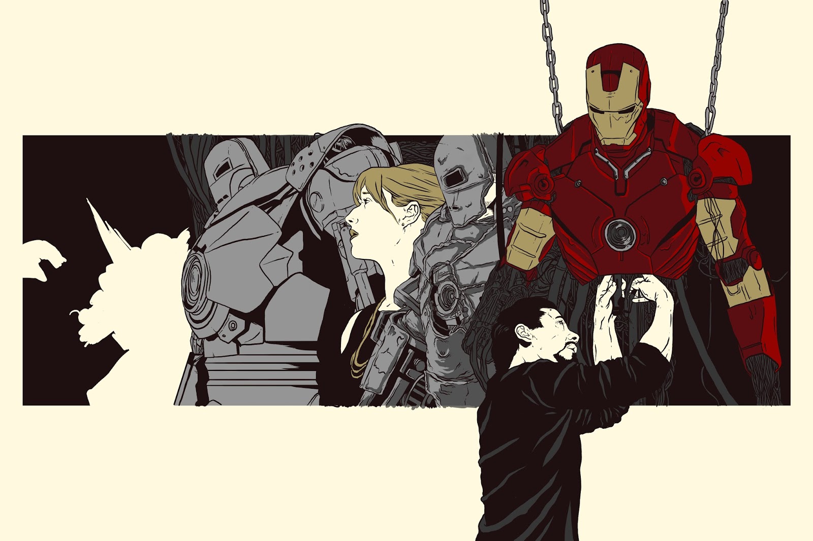
Extended Practice Iron Man Poster Layout

This is the first layout I produced for this brief at the time I was really happy with how it turned out but now looking back I think it's a bit simplistic, What this brief is really about for me is trying to push my compositional skills forward and I feel this poster worked well as a warm up for later layouts I've produced in this brief. I decided to keep a couple of elements that I've been developing within COP and bring them into this brief and the main one is working within a frame on a larger piece and then having elements that break out of that frame. Also the type on this is just for Layout purposes and will more than likely be completely changed for the final versions as I will be asking one of my friends on graphic design to give me a hand with the type after I produce a version I'm happy with.
Extended Practice Marvel Movie Posters Update
I've decided to cut down this brief massively as a feel it is far too self indulgent and isn't relevant enough to my practice going forward so far I have a set of layouts and a half finished Avengers - Age of Ultron poster so what I am now going to do is finish the Age of Ultron poster as I feel this will still work well as a portfolio piece and it seems silly to abandon it half way through, though now this will be the only poster I'm going to produce to completion the rest will be proposed in the form of layouts as I feel they would just be taking up time that could be dedicated to projects more relevant to my practice moving forwards.
Subscribe to:
Posts (Atom)