For this project my original intention was to create a book of posters in the style of old railway posters, when I first started this book there was three things I really wanted to capture in my book the first was to engage and intrigue the audience by this I mean I wanted to capture the essence of the films but I didn't want to make the films completely obvious as to what they are, when the audience are reading the book I wanted them to look at and try to work out each film. I think I succeeded to this end as the few crits we've done I've had people come up to me and ask about the films they don't recognise. The second thing I wanted to achieve with this was a high level of detail and technical skill which I'm fairly happy with how I captured this I think it's much better on some of the pages than others. I think if I was slightly less ambitious with his project I would have been able to get all my pages to look like the Inception and Tardis pages. The final thing I wanted to do with this book was capture the atmosphere and tone of the films I've drawn, I think I did this to some degree but there was a problem that when I moved away from full colour illustrations to me it became much harder to capture the atmosphere of each film and keep it as a coherent book. But I didn't just want to capture the films I wanted to keep my own voice in them otherwise the book would have been boring. As the project went on I moved away from the initial of idea of railway posters and moved towards studies based on the films instead which made my project much more effective.
Throughout my project one of the things I think I neglected is exploration of different medias, this is one thing that if I was doing the project again I would change. Due to time constraints and the way I chose to work I think I could have explored media and done more visual research if I had cut out the digital stage of my final illustrations, But at the start I intended to work fully digitally but moved away from this when I realised I wouldn't have the time to practice working digitally to get the final illustrations up to the high standard I wanted, also in my opinion I think the digital illustration lack something the traditional versions have in terms of line quality. Most of my research for this project was done through watching the films and television programs related to the films. When I was starting out on this project I was heavily inspired by Olly Moss and Mondo posters but gradually I moved away from this and started to look at artists such as moebius and this is around the time I started to move away from working digitally. I think one of the things that really got me invested in this project is the concept but I think if I restarted my project I would change the concept slightly as I was probably slightly over ambitious with what I could achieve.
One of the first few sketches I did for the first brief of this project was of the 3-d camera and this informed my whole practice for this project after I moved away from working digitally. i really wanted to capture the texture and line quality of this image I think I worked with a slightly thicker fine liner for the camera image, For my final images I started working with 0.05 fine liners and this helped me get the level of detail I intended for my pages. I'm really happy with the line quality of my pages this is one of things I've really done well with in this project, although there are some parts towards the end where I was rushing my pages slightly more I think the line quality suffered. I think working on digital layout sketches worked really well in the end but I think if I was doing the project again though I would skip this step as I think the time could have been spent more wisely.
All in all I'm happy with how my work has turned out for this project I think it's one of the best pieces of work I've ever done although obviously there are some parts I would change but I think in the end the book has come together well, I think some of the parts I don't like are only noticeable to me as I've spent so long working on this project, But when I stood away and looked through my final book I realised it works much better when all the illustrations are together and bound as a set. One of the things i'm going to take away from this project is the book binding I really want to carry on with this as I really enjoyed doing the book binding and I think it really helped the final results I want to work in sets again which lend them selves naturally to working on books. I think with this project I have met most of my initial aims even though my subject matter and plans changed, the only thing in hindsight i feel could have benefitted my project was scanning in the pages and touching them up in photoshop and printing them out, but I think theres something to be said for working fully traditionally for my book, if I printed out the pages I would have worked on thinner stock than I ended up working on which would have helped when I came to the final book binding.

26/01/2014


25/01/2014
Visual Narrative Brief 2 Book Binding
I originally intended to bind my book using a Japanese style binding and to this end I planned out the space I would need and added it to my illustrations so each had a 2 cm border where I would put the stitching. I also made a practice book In this style although the paper was a thinner stock compared to the paper I used for my final pages. So when I went to finally bind my final pages together I quickly realised that if I bound my book like this I wouldn't be able to open the book properly. So in the end I decided to perfect bind the book by putting several layers of pva down the edge of the book to bind the pages together and then put a piece of fabric across to hold them together and then i put on a final coat that had been mixed with black paint to match the front and back covers. Although this has made my book very fragile but I think it has the best finish I could have got.


Visual Narrative Brief 2 The Simpsons
After starting work on the How I met Your Mother final page I soon realised I wouldn't be able to get the page up to a standard where I would be happy with it. I decided to go back to my initial list of ideas for pages and the one that stuck out to me was the page based on springfield for the simpsons.

.png)

I'm not 100% happy with this page but I'm still happier with it than i would have been the How I Met Your Mother page. I struggled getting the buildings right and the perspective on the rail next to the road. I am happy with how the image feels very open though and to me it looks like it's inviting the viewer in.
Visual Narrative Brief 2 Game of Thrones
When I decided I didn't want to do the piece based on the hobbit as I had originally as it was too similar to the movie poster, I had to come up with a new idea and as I didn't have much time I decided to move away from the process I had used for all the other pages. For this image I decided to forgo the digital layout I'd done for all my other pages and work on the final image straight away and for this image I think it has really benefitted from it. I again chose to use a similar compositional style to the Star Wars piece which I think has really worked This is definitely going to be something i take forward from this project and use again.


Visual Narrative Brief 2 Blade Runner


I think this is my favourite page I've done for this book even though it's not as well done technically as some of my other pages, but I think this composition of the page is what really makes it but it only works when you use the black to break up the negative space at the top of the image. I think I could have improved the letters in the background as I think I messed up slightly when I was drawing it especially on the curves,
Visual Narrative Brief 2 Godzilla


This is my page based on Godzilla, I think this is one of the few pages that could have benefitted from having a mid-tone colour to break up the image slightly, i would have used the mid-tone for the smoke coming from the buildings I think the contrast of Godzilla is slightly too much as the snout just pokes out the smoke but I think when you look at the page quickly it just looks like the snout has been cut off.
Visual Narrative Brief 2 Final Pages Part 2

This is my piece based on Metropolis, I took a slightly different approach to this page than I did to the others in terms of composition which I'm fairly happy with how it turned out but this is one of the few pages that I feel would have benefitted from being a full coloured illustration. I also feel like if I had more time I could have worked on the buildings in the background much more.

This is my piece based on the Planet Express building from Futurama, For this piece I corrected a lot of the mistakes from the original layout drawing but to me it still looks a little bit off especially at the base of the tower. The perspective in this piece is also slightly off but I think this comes from the original layout coming from two different photos from different perspectives.

This my page based on Plastic Beach from the Gorillaz videos, I like this piece but I think there are a few parts that could have been improved specifically the composition of the page as I think it comes of a little bit dull compared to other pages such as the one based on breaking bad. but I think this piece has turned out well on the technical side.

This is the first page I designed based on the Bates Motel from Psycho, I'm happy with the simplicity of this piece. I like how the detailed stairs break up the page, I do think that the page could have done with another block of black at the top of the image to break up the image as it looks slightly odd now.

This is my page based on Monica's apartment from Friends, I'm not too happy with this piece as I felt it was too rushed and is not recognisable enough as I didn't have enough time to work on it and get the necessary level of detail and again I think the perspective is slightly off.
Visual Narrative Brief 2 Final Pages Part 1

This is the page based on Tatooine from Star Wars, I think in the final artwork the contrast between the sky and the buildings in the foreground is really emphasised by the more detailed approach I took to the final artwork compared to the digital layouts. The on part I would change is the suns I would have kept them perfectly spherical same as they were in the digital version.

This is the page based of the Tardis from Doctor Who, This was the second page I did after the Inception page it's also one of the ones I spent the most time on which I think is quite clearly visible in the final piece. I decided to keep the center of the tardis module blank to break up the page as I thought if I did draw in it it would just be too heavily detailed and the impact of the detail would get lost.

This is the final version of the page based on The Birds, I think this is one of the weaker pages in my book but I didn't have time to re do it in the end. I kept the use of block black to a minimum as I didn't want to over do it. The main part I don't like about this page is the figures and the faces, I just didn't have enough time to work on them to get finish I was happy with.

This is my page based on Breaking Bad, I think the strongest part of the is the perspective although some of the machinery is a little bit off I think on a whole it's not too noticeable in the finished piece. I also like that the piece is not instantly recognisable which is what I was really going for in the piece, I also think that this is the only piece I've included figures in that i'm actually happy with how they've turned out.

This is my page based on Frasier, I'm really happy with the foreground of this image but to me it starts to fall apart when it comes to the depth of the piece, this is something that in the future I intend to research and practice. My favourite part of this piece is the chairs I'm not sure why but this was the part of the page that I enjoyed drawing the most and i think they turned out really well.
Visual Narrative Brief 2 2001 A Space Odyssey


This is the final line work and final page based on 2001, this is one of my favourite pages in the book I really like how the rocks have turned out it gives a real sense of texture, but i used the silhouetted apes and monolith to break up the highly detailed areas. the only part i'm not 100% happy with is the clouds but it's not something that was urgently in need of change.
24/01/2014
Visual Narrative Brief 2 Inception Final


This is my final version of the page based on Inception as you can see I've left space on the left to Japanese bind my book. I'm really happy with how it's turned out there are a couple of bits I would have liked to change such as the tiles on the roof the perspective is wrong and i would have probably preferred to re do the faces, but to me a big part of this project is that the final product is completely made and drawn by hand. I left the roof on the left white as I thought it really helped to break up the image when I did try filling it in black I felt it made the image seem too enclosed, I think the negative space really opens up the image. I also experimented with colour on this piece it was the only one I did this on as soon after I did it I decided that I thought it would work better in black and white.


Visual Narrative Brief 2 Moebius
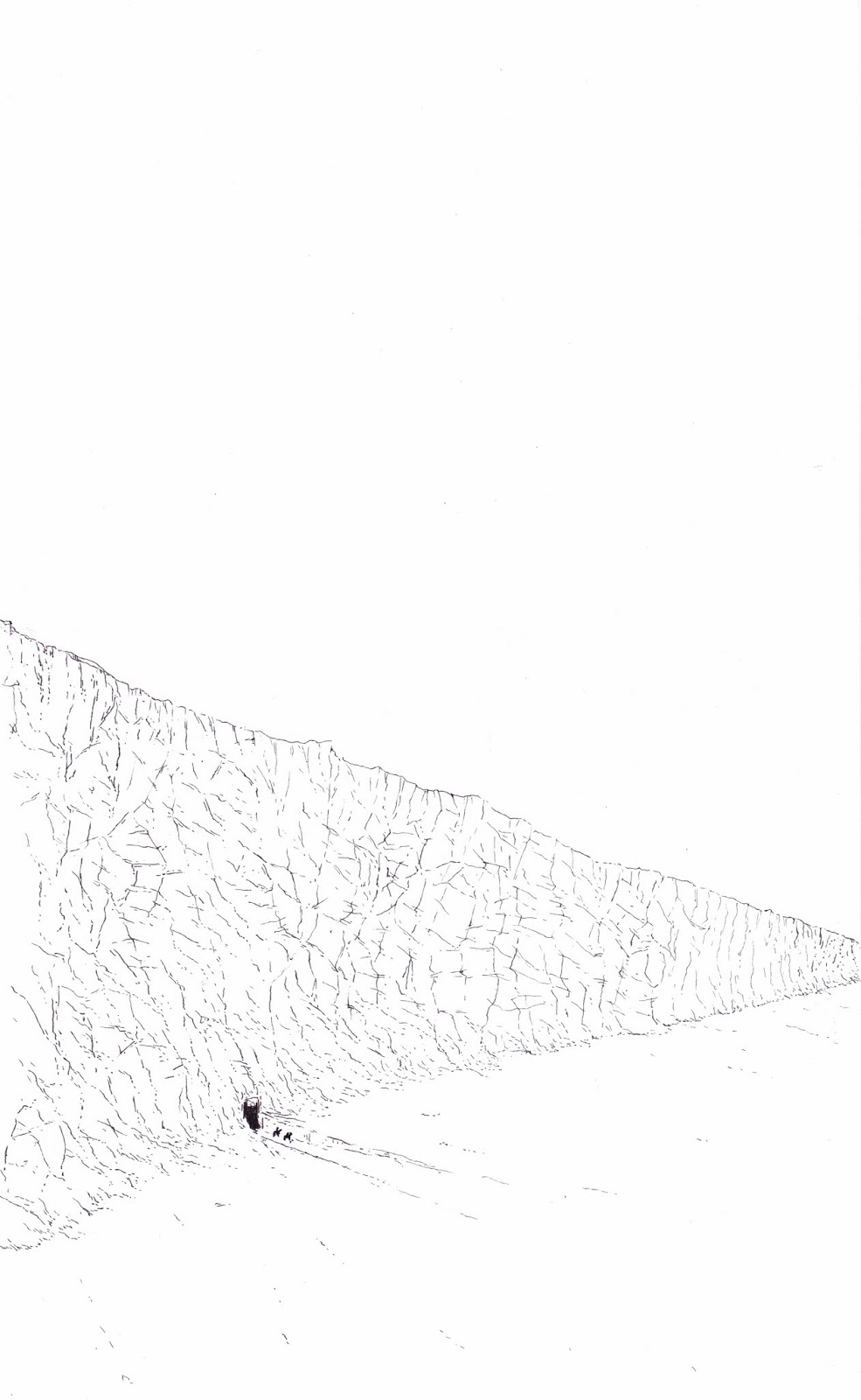
With my final pages for this project were heavily influenced by Moebius, I wanted to create a similar kind of feeling towards texture in my images. I love all of Moebius' work I especially think his world building is really great, it feels as if all his images are based on real places that have been lived in for years.


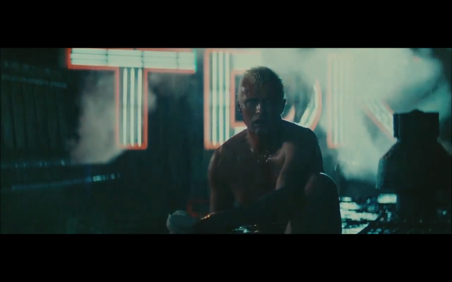
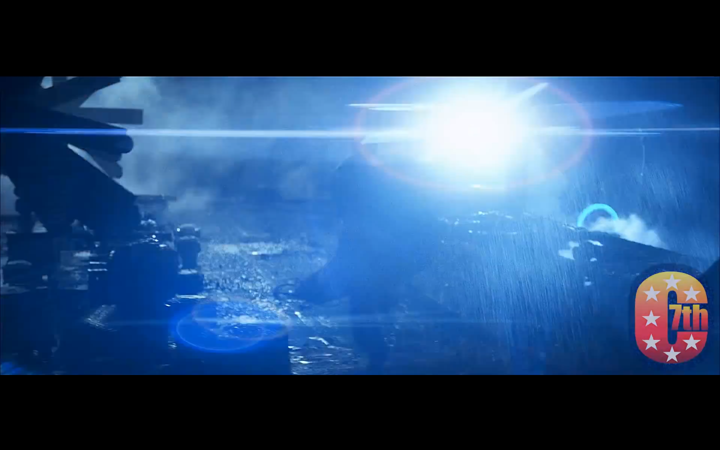
Visual Narrative Brief 2 Blade Runner re-done
 As I thought I had enough time I re did my blade runner Idea as my ideas have moved away from being purely based of locations have moved towards being film based, I decided to go to the iconic final scene in Blade Runner. I really wanted to capture the atmosphere and noir look to the films, I also thought as the Star Wars image had worked really well I'd try keeping most of the Illustration towards the bottom of the image.


Subscribe to:
Posts (Atom)