
13/05/2015
Applied Illustration Final Product photos
I went to photography to take photos of the final product, I'm really disappointed with how they've turned out I don't think the camera was white balanced properly so the photos have all come out with a yellow tinge. Usually I'd put them into grey scale but due to the images having red in them it makes them much harder to edit without ruining the colour. Though the photos haven't turned out how I wanted they give you a good idea of the product.
Applied Illustration T-shirt Mock-ups


These are my designs mocked up on to t-shirts and I'm really happy with how they've turned out, I think they look very professional and work well as part of the set of products I've designed for this module. I'm disappointed I won't be able to produce these though as I don't have the time or resources available at this point and I'm not sure I could get them up to the level of quality that I want.
Applied Illustration Flyer

Applied Illustration Initial Boards


These were my initial boards for the final crit, though after the feedback I received in the crit I think I need to take a step back and remove the majority of the text as I think it's too much, I'll look at putting the text in my project report or in a separate blog post.
Appied Illustration Final Vinyl Mock-ups
These are my final nets and mockups of the final sleeves, I'm really happy with how these have turned out and I'm looking forward to getting them printed and seeing the final products.
Applied Illustration Final Web Page Designs


These are my final designs for the website, these are only concepts as I needed something to put on my boards to go along with the proposal for the website. The image on the left for the making off video it's based on some work from my visual journal. the full explanation for the website is on my board.
Applied Illustration Website Design


These are my initial designs I've done for the companion website for this album as you can see there is room for more albums and this will easily work as a template that can be changed to fit each album. The website will also work as a streaming tool to listen to the album offline and they can download a digital version of the album.
The design was based on the pre-existing Pitchfork website, I took some parts from it such as the logo and the top banner for there network of websites. Though I didn't want to copy the whole design I decided to adapt the design and try and make it more modern, I used the same font as the one used on my Kanye West sleeves.
http://pitchfork.com/
Applied Illustration Posters


These are my three final poster designs based on the artwork I did for the record sleeves, each poster will be printed at A3 onto the same stock as the record sleeves to ensure that the colours are consistent across both. The type was influenced by my earlier work on the sleeve designs I did, I wanted to keep the type simple and easy to read. I kept it spaced out so it balanced with the design and wan't overbearing. The "//001" in the bottom right corner refers to the first wave of record releases which is all the 5 albums I proposed at the start and this would leave it open so Pitchfork could release more waves after.
Applied Illustration Final Image

This is the final image I've done for the first record sleeve, I reused some of the earlier work I did for my visual journal then adapted it and worked into it to work as a final piece. I'm really happy with how this turned out and I feel the textures especially have been really successful, I decided to keep the artwork quite rough as I felt it worked better as part of the set and if it looked too clean the textures would look odd.
Applied Illustration Final Imagery

These are two of my resolved images for the final sleeves, they both have slightly different approaches to the final images but I still think they work together well as a set due to the colour scheme and the textures I've used. The first image is for the song Runaway and the second is for the song Who Will Survive in America, I chose these song as because of the way the album is split onto record there are 3 records and each of these songs is on a different record Runaway on the second and Who Will Survive in America is on the third, so now I just need to produce an image for the first record sleeve.
Applied Illustration 7" Type
At one point I was planning on producing 12, 7 inch records for the module and these were the backs that I designed. I think the type on these has really influenced the direction I took with the design of my work for this module. I picked quotes from the songs that I felt were poignant or really reflected the ethos of the song or album.
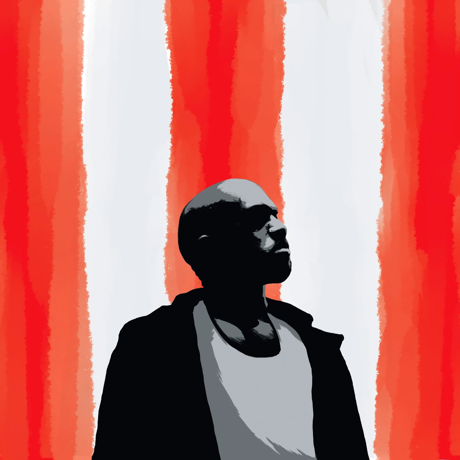
Applied Illustration Kanye Development


This is my piece for the Kanye album cover, I really like the idea but I don't think it's really turning out how I wanted it to, I think I'm going to take a step back as I'm really struggling to create work without using line work as I feel it's something that a lot of my work heavily relies on.
Applied Illustration Colour Pass

I did a quick colour pass over my initial thumbnail I did, This is going to be the colour palette I use for my final illustrations. Though I think I'm going to try and incorporate some texture into the image as it looks far too flat like this. I'm also going to try and have some variation in the tone of the colours to create some variation. I wanted the colours to really stand out and be really eye catching thats why i've picked this bright red, also the stock I've decided to print on tends to dull the colours so I need to make sure they're very bright before printing.
Applied Illustration Thumbnails


These are some quick thumbnails I did for the final artwork that will go on the record sleeves, the images will be 7"x7" and will be in the middle of the 12" sleeve with a slight white border. These images are pretty simple but I think the bottom two could work really well with some more work.
Applied Illustration Process

This is a piece I did for Responsive and i'm really happy with how it turned out I think it's definitely a step up from my last attempt at digital painting, I'm going to incorporate this into my final pieces for this module as I think the process has been really successful for me.
Applied Illustration Nets

This is my net I made for the record sleeves this is the 7" version but it can easily be scaled up for the 12" version, though if I do that the tabs will probably need to be shrunk down slightly. I need to think about what stock I'm going to use for the sleeves as I don't want them to be too flimsy but if the stock is too heavy it could damage the records.
This net is simple as the sleeves are only a very simple design I just need to think about how I'm going to produce the outer case for the sleeves to go in.
Applied Illustration Vinyl Contextual Research
http://www.gigwise.com/photos/100442/1/best-vinyl-and-most-beautiful-releases-of-2015#gallery
Applied Illustration Contextual Research Unknown Pleasures
http://fierstdesign.com/joy-division-box-set/
This box set was a big influence on my final project especially the use of the window, which I've used in my final design though I've adapted it so it works for my project and where as the joy division is made out of wood mine will be made of card as it's completely unrealistic to attempt to make mine out of wood as I wouldn't know where to begin even if it would look good.
Applied Illustration Vinyl Packaging Research
This is my research into packaging design for album sleeves, some of these are really interesting and once I've finished my artwork I'm going to look at how I can incorporate these into my design for the final sleeve.
Applied Illustration Kanye Research
I've gone back to my initial board I made for my Kanye research and added to it, I wanted to look more at the man himself, as I think a lot of his music relates to his ego and personality so I want to reflect this in the artwork I produce.
Applied Illustration Deliverables
The final deliverables for my brief are now...
- 1 Lp Package - 3 sleeves, front and back covers. 1 case to hold the sleeves. 1 flyer.
- 3 Posters each featuring the design from one of the sleeves
- 3 T-shirt designs mocked up featuring the sleeve designs
- Website mock-ups
Applied Illustration Idea Change
I've adapted my idea I'm going to focus on one album and produce what I initially intended to which is a full package for my final piece I'm going to create 3 sleeves and a case for Kanye West - My Beautiful Dark Twisted Fantasy. I'm also going to adapt the design so it fits on Posters, T-shirts and I'm also going to produce a website to feature the artwork and information about the album as a companion piece to the album.
Applied Illustration Spiritualized Digital


This was my first attempt at doing a digital painting, this image is very different to how i'd usually work. I decided to avoid using line work and was working with shape much more, I think this image has turned out ok but I think I need to practice this process much more to end up with a product that I'll actually be happy with. The image on the left is a quick colour pass that's ok but I think the greyscale image is much stronger.
Applied Illustration Paintings

Applied Illustration Wilco Inside Cover

This was to be the inside illustration for the Wilco album I was doing I really liked how this was turning out but it was unrealistic to try and produce this. The fold of the sleeve would have gone down the middle of the doors of the store. The image is again based on depictions of american suburbia and I think this would have worked really well with my proposed front cover.
Applied Illustration Digital Layouts


These are my initial layouts for the Spiritualized and Wilco album covers, they're very rough and have only been produced as a guide for when I start painting tomorrow. The reason they are different formats is because of the image for the wilco album cover is only at the bottom and the rest is negative space so it's easily adaptable as a poster, where as the Spiritualized image fills the frame so it needs to be done at the scale of the poster and then can be cropped down for an album cover.
Applied Illustration Idea Development
I've adapted my idea slightly to only producing the front covers for the albums as I feel at this point it would be unrealistic to try and produce 5 sets of illustrations including front, back covers and inside illustrations. I feel like this will allow me to focus the work more and produce much higher quality final pieces. I intend to start painting my final pieces next week.
Subscribe to:
Posts (Atom)