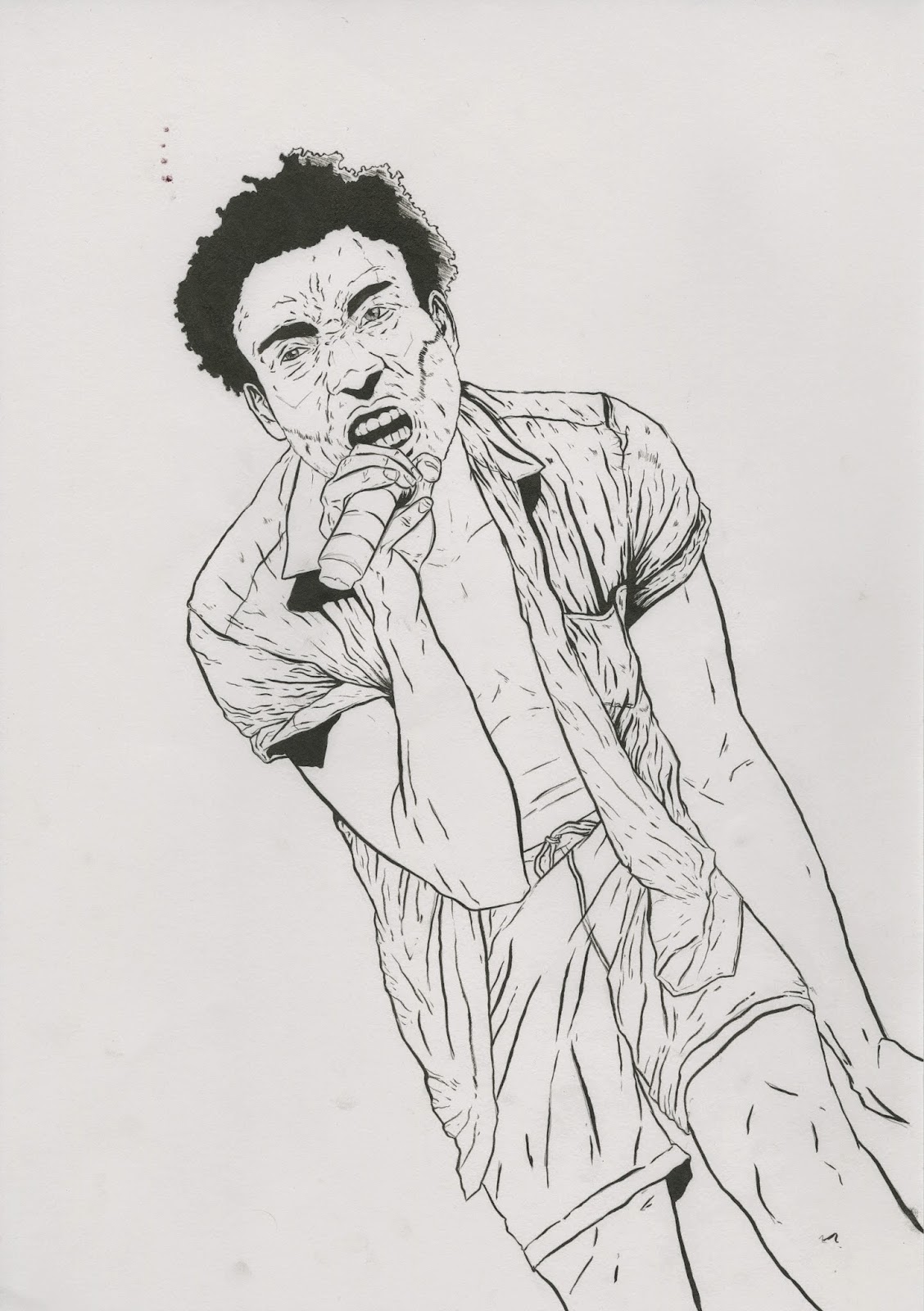
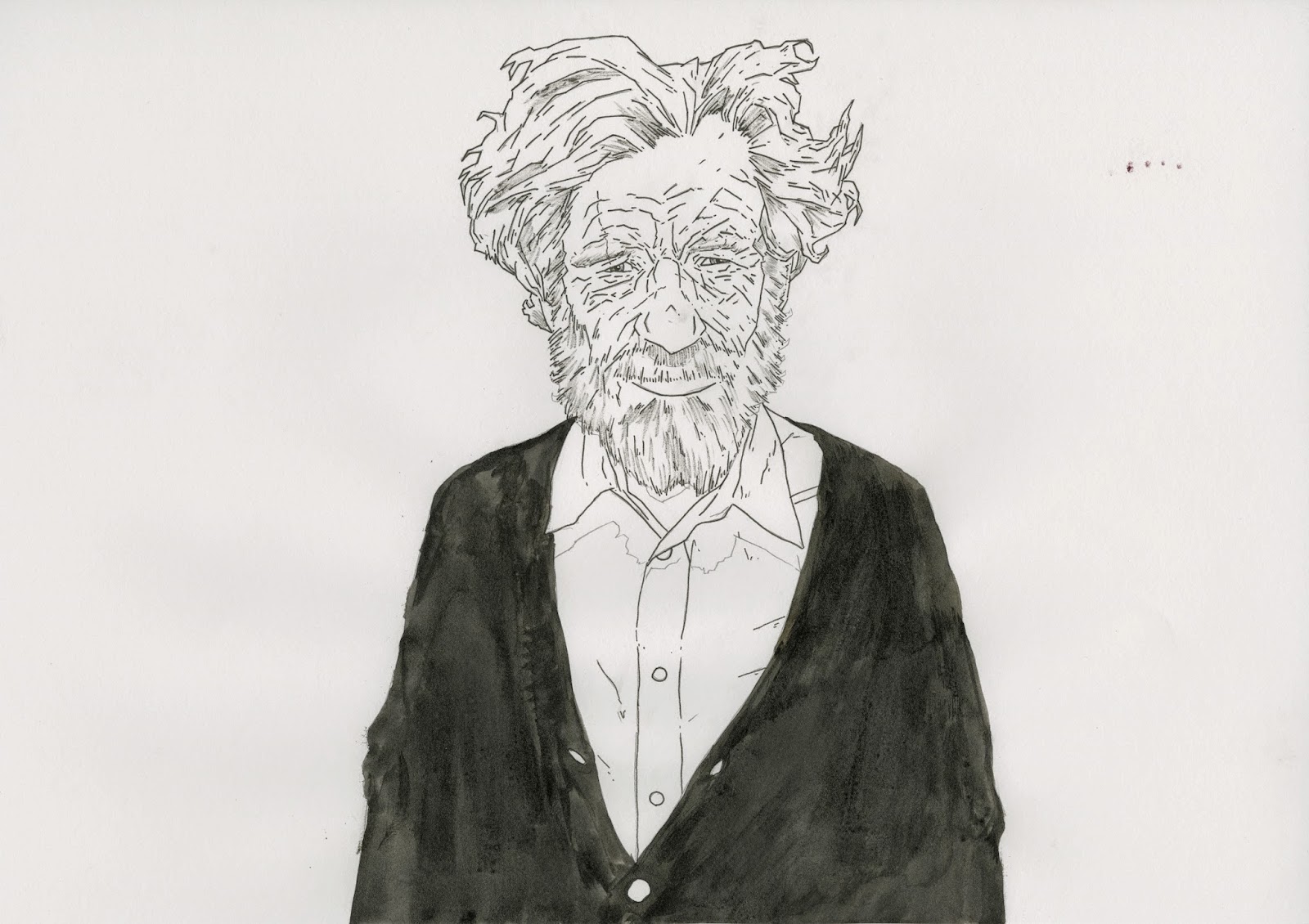
I found these illustrations based on the deaths in the HBO show Game of Thrones I really like the style and that it's more shape based and this could be something I look at incorporating into my moving images work. I think the one image that really doesn't work well is the one where they've added more detail and tried to do a proper portrait. i think my favourites are the ones of the woman with the arrows and the one where the mans throat has been cut and the blood turns into birds.
23/11/2014
22/11/2014
Process and Production Mike Mignola Contextual Research
I've looked at Mike Mignola because I really like the way he uses composition and colour in his work which gives it a really unique tone of voice. The colour for the images is done by Dave Stewart and I think its what really makes the images really work even though the majority of the images are covered in black ink the flat colour is what makes the really come alive. This is something I want to look into taking into my printed work.
I also found this interview with Dave Stewart and how he works with colour, and how he uses it to set a mood and tone for scenes.
http://www.tor.com/blogs/2010/08/an-interview-with-colorist-dave-stewart
I also found this interview with Dave Stewart and how he works with colour, and how he uses it to set a mood and tone for scenes.
http://www.tor.com/blogs/2010/08/an-interview-with-colorist-dave-stewart
Process and Production Typography
This is my initial idea for the type for my poster, I like the font but I think the layout is too spaced out and isn't as bold as I'd like it too be.
This is the second version of my type and I think it works slightly better than the first though it could still be improved. I think I definitely refer the tagline from this one as well it definitely presents the themes of the book better than the first. though i'm not sure about having the author's name on one side and the date on the other.
This is a much more developed version of my type and in my opinion much better. I changed the way the main title worked by enlarging the "gods" type and putting it under the "american" type, I think it works much better this way and is much more bold. I also added some of the standard tropes you'd see on a film or tv series poster such as the HBO logo and the R-rated logo ( I added this rather than a uk age rating because the poster is geared towards an American audience as HBO is an American TV network.) I also added the names of the actors in the same font as most standard film posters use. I kept the type on this version much tighter and compact and I think t works much better than the other two versions as the smaller text serves to emphasise the "American Gods" title
Process and Production Print Ideas Development
This is a poster design I did based on the "Coming to America" sections of American Gods, I'm happy with how the final images have turned out. I edited the initial poster on the left and added a subtle gradient in the background which made the background much smoother, though it made the image unsuitable for screen printing. I'm really happy with the drawing of Wednesday and the raven on the left I might try and repurpose these for future pieces, like I reused the drawing of Wednesday for my animation.
This is a concept I did where I changed the format of the piece and took the Wednesday drawing and re used it this would be screen printed onto coloured paper, I got the idea of the boxes on the side from Mike Mignola's work each box would contain a character. I think the type in this poster works much better than previous attempts.
On the left is my initial idea for the composition of the poster with very simple typography on the right is a much more developed version of the piece.
20/11/2014
Process and Production Drawn Animation
This is my drawn animation for this brief I'm fairly happy with how it turned out, but I did the entire thing in photoshop and I feel it could definitely be improved by taking it in to After Effects and adding the text then and adding a fade in and out. I also want to edit out some of the frames towards the end that don't work as well and loop the initial animation more.
Process and Production Game of Thrones Sting Analysis
I think this is my favourite sting I've found, It works so well and similar to my idea for the moving pictures brief it focuses on the characters and key motifs. I think it really captures the dark atmosphere of what i'm going for with my stings, I also really like the way they use lighting in the stings and this is definitely something i can think about including in mine.
Process and Production Sting Analysis
I also looked at these stings which are probably more in line with what I'll be producing for my animated stings, though these are a lot longer than the stings i'll be producing. I think these are closer to what i'll be producing as they contain no dialogue just music and the driving force of the stings are the text, characters and motifs that really give you a sense of the shows identity.
Process and Production True Detective Trailer Contextual Research
I decided to look at the tailer for True Detective as I think it shares a lot of similarities thematically with American Gods and is also on HBO which I envisage this TV series being on, I think the voice over for this trailer works really well to get you interested in the series and links all the scenes in the trailer together. The subtle music works really well together with voice over. I think the pace of the trailer works really well even though this series probably isn't the most action packed the trailer gives you a real sense of anticipation and feels action packed. It also gives you a really good sense of the characters from the voice over and the quick shots of each character.
15/11/2014
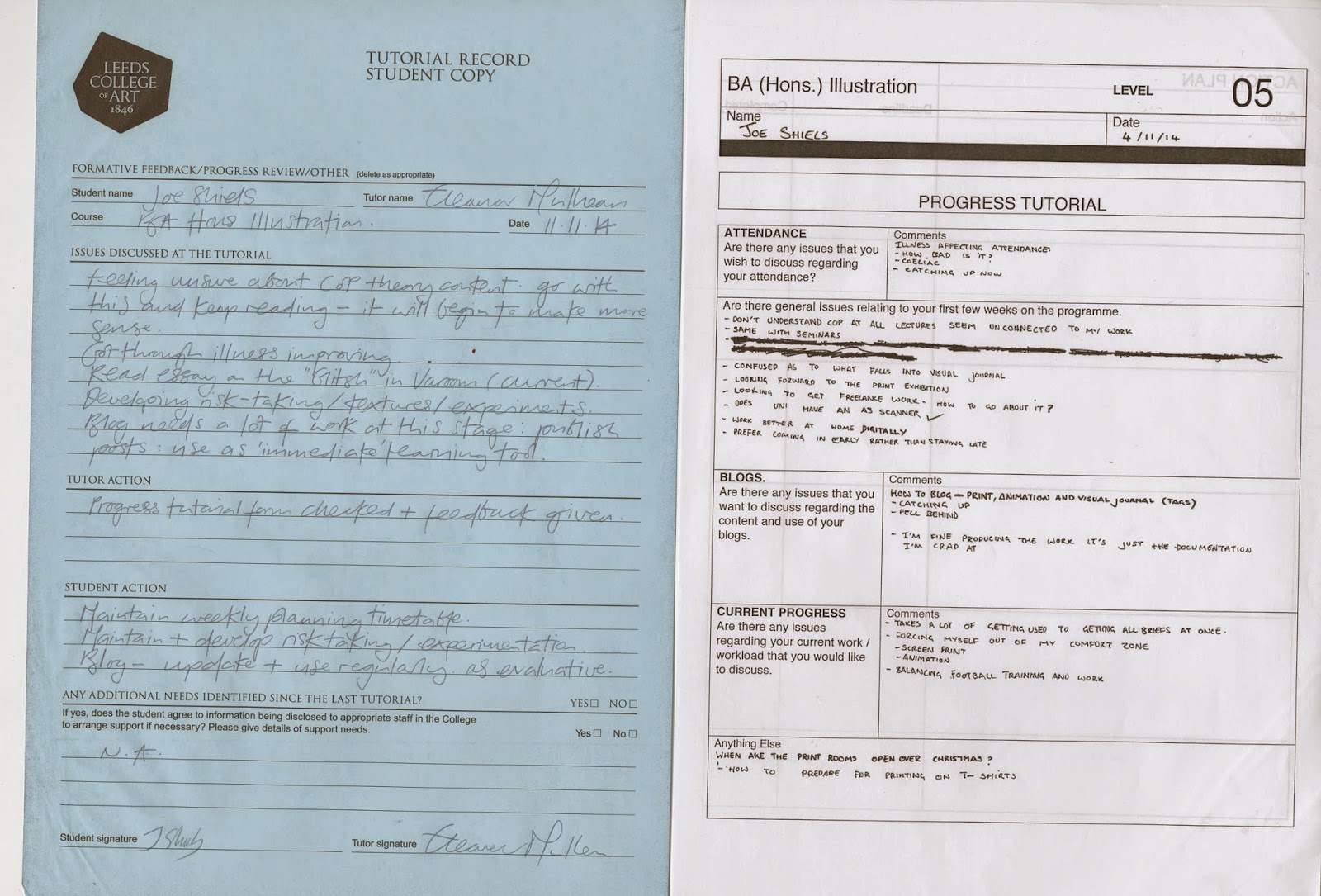
Process and Production Tutorial
13/11/2014
Process and Production Poster Development
These are some posters I did to see how my final pieces might work I was having trouble trying to work out how to fit type into the image. As I was thinking of using these for screen printing I decided to keep it simple colour scheme wise seen as I'm not particularly confidents using screen print at this point. The one on the right is my final version as I think the slight gradients I added make the image look much smoother than the one on the right. I based this poster on the Coming to America chapters from American Gods based on the vikings coming to america and bringing Odin (Mr Wednesday) with them.
This is my Initial Plan I did of the Poster with the text on it I feel the image was much stronger without the text, though I like the initial concept for the text though it definitely needs to be refined for my final posters.
10/11/2014
Process and Production Moving Images Proposal
I intend to produce...
3-6 10 second stings based on the novel American Gods by Neil Gaiman for a proposed tv show, these would work as a promotional tool for the potential tv series.
The content will focus on...
I intend to focus on the duality of the characters in the books and the contrast between the characters and there gods, most of the focus will be on the characters themselves and different aspects of there personality and motifs related to them.
I will be aiming to communicate...
A similair atmosphere to my poster and t-shirts, I really want both outcomes to work well as a set. The main point of the animations though would be to work as a promotional tool for a film or TV series and to get people interested in the show.
To an audience of...
The audience will be the same as the poster and t-shirts... 16-50 year olds the audience i'm aiming for are the type of people that watch HBO shows such as The Wire, Game of Thrones and The Sopranos, So I want it to apply to a mass audience rather than a niche audience. It would have to make people want to watch the show and not just apply to Neil Gaiman fans.
The audience will be the same as the poster and t-shirts... 16-50 year olds the audience i'm aiming for are the type of people that watch HBO shows such as The Wire, Game of Thrones and The Sopranos, So I want it to apply to a mass audience rather than a niche audience. It would have to make people want to watch the show and not just apply to Neil Gaiman fans.
Process and Production Printed Pictures Proposal
I intend to produce...
I want to make an A1 screen printed film or television poster for a series based on American Gods by Neil Gaiman. I want to keep the product fairly simple but I want to produce the final piece on coloured paper and make a few variations on different coloured paper and I also want to try out metallic inks for the title. I also would like to produce some screen printed t-shirts reusing some of the assets from the poster and the animation.
The content will focus on...
I will focus on the characters and narrative of the book American Gods and how they can be portrayed through a film poster and set of t-shirts. I really want to get across a sense of atmosphere and the personality of the characters.
I will be aiming to communicate...
I want to communicate a dark atmosphere fitting of the book the film would be based on, I also want to communicate the key narratives of the characters and the split personalities of the characters.
To an audience of...
16-50 year olds the audience i'm aiming for are the type of people that watch HBO shows such as The Wire, Game of Thrones and The Sopranos, So I want it to apply to a mass audience rather than a niche audience. It would have to make people want to watch the show and not just apply to Neil Gaiman fans.
Process and Production Animation Concept
These are my notes on my initial concept ideas for my animation. I was also deciding which characters to put in my stings, and motifs that relate to these characters that can be used, I'm also thinking about doubling up some of the characters in the stings. The idea was inspired by this drawing from my visual journal of the main protagonist Shadow.
Process and Production Developed Screen Prints
This time for screen-print I spent more time preparing my initial negatives and spent more time thinking about what I was going to print on and the consistency of the ink, which I think really worked well for these especially the ones on the black, blue and burgundy paper I intend to go back and do some more of these in white ink. I think this is something I can use moving forward it also helped get the line consistency for the wednesday piece I did.
Process and Production Initial Screen Prints
These are the first Screen Prints I've ever done and I'm fairly happy with how they've turned out, I'm a bit disappointed I didn't get the consistency I was going for and some of the block colours come through faded. I also lost some of the line quality from the initial drawing, I'm going to go back and do my Spider drawing done with a brush pen and I think the thicker lines will lend themselves towards screen-print much more. Overall screen print is definitely a process I intend to return to and use for my final printed product.
Process and Production Visual Journal Developed Pieces
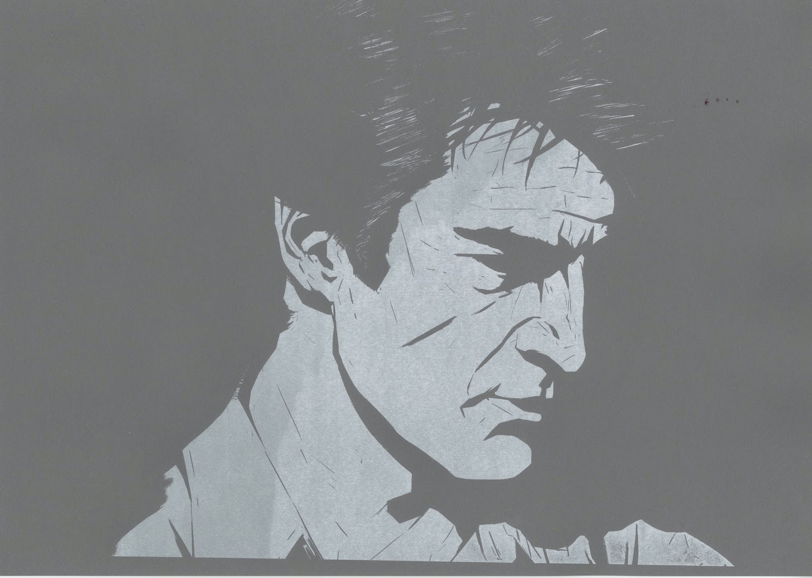
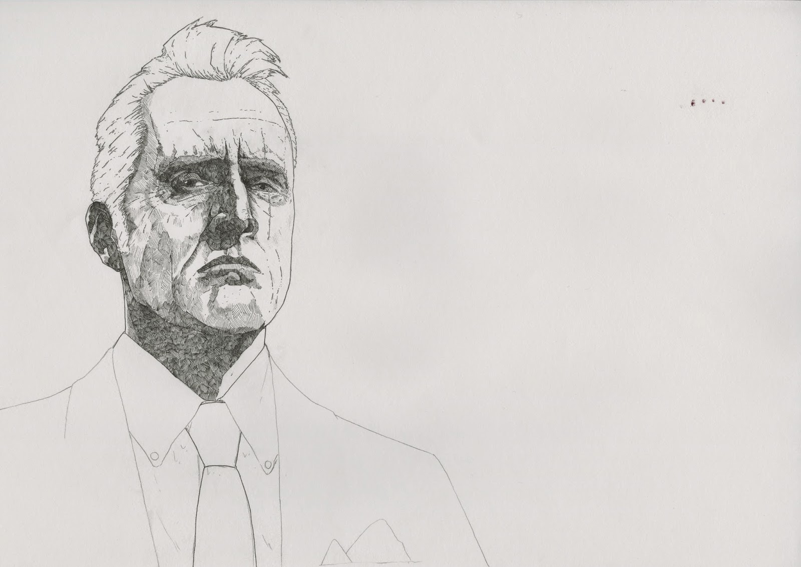
These are two examples of the developed pieces taken from my digital sketches and traced over on a light box and then worked on. I'm paticularly happy with the Mr. Wednesday piece done with a 0.05 fine liner I think the detail works really well and it's really captured the atmosphere I was going for. I'm also happy with the Spider piece done with a brush pen I think the quality is similar to a digital brush but I prefer the traditional method and it probably took me half the time.
Process and Production Visual Journal Character
These are some digital sketches I've done based on the characters from American Gods I intend to print these out and put them on a lightbox and work on them with traditional media.
Process and Production Stop Motion and Dragon Frame
I made a very simple dragon frame animation using my cut out assets, I decided to keep it simple and I made some clouds and a plane to match my earlier work. I made the clouds larger than the frame so they could slowly move across the frame and give the effect of the plane being far away as it slowly flys across. I'm not happy with how this turned out as the plane moving across isn't smooth enough and I should have brought a sheet to use as the background rather than a cutting mat, But at the moment I am leaning more towards doing my animations in After Effects rather than Dragon Frame.
Process and Production Self Evaluation
What 5 things have you gained from this work and how will this impact on your practice?
- I've learned not to rely solely on my line work and try to incorporate more texture and shape into my pieces.
- Using printed textures works really well to give some depth to the image.
- Minimal use of collage can be really effective and add another quality to the image.
- Collage isn't something I intend to carry on with in the future.
- I can put down Ideas much quicker using shape and textures rather than drawing it and trying to make it perfect the first time.
What 5 things do you intend to explore further through your visual journey and why?
- Including clouds and smoke in my work I think this can be really effective, especially when done with ink and wet paper.
- Minimal use of colour can work well with limited colour schemes, this is something to think about for the printed pictures brief.
- I really want to start incorporating characters and figures into this work.
- I also want to start scanning it in and digitally working with the images.
- I definitely don't want to do anymore collage though.
What themes do you intend to explore further through your visual journal and how will you explore these visually?
I intend to explore character much more now and also look at American culture and travel, so I can incorporate the images of clouds and planes in to my work also the motels can fall into the American culture and travel categories.
I intend to explore character much more now and also look at American culture and travel, so I can incorporate the images of clouds and planes in to my work also the motels can fall into the American culture and travel categories.
How do these themes relate to your research into your chosen author?
My themes relate to my book well because when I first picked them I literally picked them out of the book such as the liberty dollar owned by Shadow and the Chevy Nova he owns, Plus the motels he and Mr. Wednesday visit through out the book. My themes are just a natural extension of the motifs I picked and I intend to start to incorporate characters from the book into this.
My themes relate to my book well because when I first picked them I literally picked them out of the book such as the liberty dollar owned by Shadow and the Chevy Nova he owns, Plus the motels he and Mr. Wednesday visit through out the book. My themes are just a natural extension of the motifs I picked and I intend to start to incorporate characters from the book into this.
Process and Production Collage and the Intangible
These are my collages I did I'm not happy with how these turned out but I'm really not interested in collage as a process, but I think it's worked well in the minimal use of the ink drawing of the clouds and the planes. I also think the printed texture works really well as well, I probably should have produced more but due to being ill I only managed to do a few.
I also did these pencil drawings which I'm really happy with and I think they reflect the atmosphere I was going for much better than the collage pieces I did, though I feel they do look a bit too idyllic.
Process and Production Summer Brief Initial Drawings
For my summer project I made some initial Drawings based on some of Neil Gaiman's work and his Characters to get a feel for the project and wether I'd be able to sustain my interest for an entire project. I'm really happy with how some of these turned out especially the way I've captured the characters I think has worked well.
09/11/2014
Process and Production Initial Research and Motifs
For my project I've decided to focus on American Gods and I've decided on my initial 3 motifs being classic American cars, focusing on cars like the chevy nova they use in the book, Motels as they become a recurring in the book and are visited numerous times and finally I chose to use Liberty Dollars like the one shadow gets given by Zorya Polunochnaya.
Follow Joe's board 504 Ref on Pinterest.
Follow Joe's board 504 Ref on Pinterest.
Process and Production Lines and Mark Making
For my different line variations I used a 0.05 fine liner, a copic felt tip and a brush pen for my 3 different lines and I used these to make 5 lines and then 3 variations of that with varying thickness with the same media.
These are my drawings I did using the different lines I came up with some of them are alright but this isn't something I feel like realistically I'm going to use moving forward. Though I probably could have experimented slightly more with the way I went about doing the images as i feel I might have slightly rushed them just to fill the 16 image quota.
Subscribe to:
Posts (Atom)
