18/05/2016

Extended Practice Evaluation


Overall I feel that I’ve really learnt a lot this year and it’s been my most valuable one at university I really started to engage and wrestle with what my practice is and what that means for me going forward, I’ve also stopped limiting myself to wanting to just do comic books and I’ve moved on from that comics aren’t for me and that’s ok. I gained a lot of experience this week from working with nightmare clients to more collaborative work, I feel my works really starting to head in interesting directions and I’m excited to see where it takes me. I feel like I'm finally at a point with my work where I can finally describe it accurately and concisely to someone who has no idea about illustration or design, which is really encouraging as it's given me direction moving forwards.

I think one of the problems I've had in this module had been direction which got resolved towards the end of the year and I think the work really improved after that. I also had a problem with my Nike brief that I tried to take too much on and take on multiple roles that I wouldn't need to do when I leave uni, This lead to problems resolving the project as I wanted to do everything. I had this problem with a couple of briefs where I tried to make them all Big Kahunas and huge briefs where I should have been working smaller and then capitalising on the work. I feel some of the more succesful briefs were ones where I didn't worry about the outcome and enjoyed the process like the composition brief and the Nike brief.

Extended Practice Project Report

Extended Practice All Boards

Extended Practice Statement of Intent

Extended Practice Promo Video

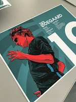
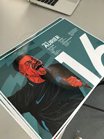
Me and Matt got in touch with Kit Cowey on Vis Com to create a video promoting the collaborative work we did together, I'm really happy with how the video's turned out. I think it showcases the work we've produced together really well. I did suggest that we reshoot the posters and covers as they've come out slightly grainy.

Extended Practice Nike Cosmos Boards

Extended Practice Banner 2


This is another concept for a banner that would be displayed in Nike stores, I'm happy with how this turned out I decided to keep the large numbers and info from the book again and I feel this could easily be adapated for each player so that the prominent player in that region would be the player in store.

Extended Practice Banner


This is a rough for the banners that would be displayed within stored though the colour scheme would be different to this image it'd be the same as the colour scheme in the book.

Extended Practice Poster Mockups


These are the first billboards that would be displayed as part of the cosmos campaign they wouldn't have any other information on them, this would then begin to build hype and speculation about what it could be before the reveal of the registration for the competition.


Extended Practice T-shirt Design


I was really disappointed my screen got stolen so I couldn't print my own t-shirts but for this project and due to time constraints I've not got time to clean another screen, I really struggled with getting the size of the type on the back of the shirt right but I think this works and gives the idea of what I was going for.


Extended Practice Composition Boards

Extended Practice Bayern Poster

Again following the template of the last two images I designed this layout based on Bayern Munich who won the Bundesliga, It's tough to work out what the focus of this image as with Leicester there was the trophy lifting and with PSG there was Zlatan who was leaving so I tried to keep the layout without focussing one player and I sized the players in order of importance to the season. I'm really happy with how these layouts have turned out and I'm really excited to move forwards with them but at this point as part of this brief this is as far as they're going to go.


Extended Practice PSG Poster


This is a rough layout I did for my PSG Poster I'm really happy with how the layout turned out i think it's much more succesful than my leicester layout I think the dynamic scales of the players really adds something also it was much easier to find images of PSG players as they're a much more popular team. I'm going to double expose an image of PSG lifting the trophy onto the large image of Zlatan as well.

Extended Practice Leicester Poster


This is a poster layout I came up with for a poster celebrating Leicester winning the premier league it's the first of three one for each of the Premier League, Bundesliga and Ligue 1. I feel this layout is pretty succesful but there are some changes I need to make such as varying the scale of the players slightly more, I also feel that working in a photo collage only really allows me to come up with a really rough version as when I draw the design I can scale parts of the references to fit the design better such as the scale of the premier league trophy I'd change it so that Ranieri was larger without cutting out the top of the trophy. The image will have text in the top left with the names of the players there squad numbers and appearances at the bottom.

Extended Practice Brief Adaptation

Though I set out for this brief to be all about creating work for my portfolio which eventually it may become but alas as part of this module the brief became an exploration of composition and roughs within my practice. It became about creating compositions for things that I enjoyed and helped scratch an itch that kept me going with other briefs this became my brief that I worked on in my spare time just for fun to explore how I could compose images to lead the viewer though an image.

Extended Practice Penguin Boards

Extended Practice Secret 7" Boards

Extended Practice Final Ticket Stub


These are the final designs for the ticket stub, I incorporated the pattern from the illustrations on the back and I changed the colour scheme. This would be included in the pack with the publication


Extended Practice Stock Tests


I tested getting my spreads done on a couple of different stock options but in the end I decided that the glossy stock suited the work best which is the same stock we used for the posters and programmes. I've never really used glossy before this year but for some reason it really seems to suit my illustrator based work.

17/05/2016

Extended Practice Final Publication

This is the final publication I produced for the Nike brief I'm really happy with how it turned out I think the illustration work really well with the type layouts. I think this is probably the strongest piece of illustrated work that I've ever produced and I'm really happy with how it's turned out.

Extended Practice Pack Presentation


When the packs sent out this is how it would arrive to the players, The home kit and away kits and then there custom Cosmos t-shirt. The book would be underneath the shirts kept flat.

Extended Practice Box

This is the box I printed my design on that the pack would be sent out in, I took a Seawhite Archival box and foil printed onto the top of it. The design works really well when it catches the light unfortunately the foil didn't come through as well as I would like.

16/05/2016

Extended Practice Colour Scheme


I updated the colour scheme of the images as I felt the blue shirts wasn't really working and I'm really happy with how this image has turned out so I'm going to apply this colour scheme to all the images I also added a background pattern to help break up the block colour I'll use this pattern across the promo material for the project.

Extended Practice Comic Boards

Extended Practice Thought Bubble Boards

Extended Practice Posters Boards

Extended Practice Programme Design Boards

Extended Practice Final Sheffield Covers


These are the final covers for the Sheffield United and Wednesday programmes, I don't feel that these covers are any where near as strong as the Liverpool and Everton covers because I had to change the method of making the illustrations to fit Matt's plans for applying the illustrations to different products and sizes. These are my first attempts at vector illustrations and I think there's still a way to go compared to what i'm producing now. The composition of the blades cover really bugs me as well due to the illustration being of center which we should have really planned for.


06/05/2016

Extended Practice Redone Book Layout


This is my redone layout I felt that the last layout just wasn't working as well as I wanted it to it was just floating in the middle so I've aligned the text to the left and then looked at how I can use the numbers in an interesting way. Also I found a way to incorporate quotes and the years players were at each club.

03/05/2016

Extended Practice T-Shirt Contextual Research


These are some T-shirt designs that Nike did for Paris Saint Germain and Manchester City I want to produce something similar to go in my pack that's sent out to the players, I'm going to take the existing logo I've made and create a new version specifically for these t-shirts and then put the word Cosmos across the back of the shoulders in a similar manner to Bayern Munchen.

Extended Practice Book Layouts


This was my initial rough for the double page spreads in the book on the Nike sponsored players and it worked for players like Pique as he has a fairly short name and club history, but for players like Ibrahimovic it was a problem so I created a template in InDesign that would work for each player. So I set the names for the shortest and longest possible ones and for the longest and shortest club history, I think the template is ok but I just feel the designs are too floaty at the moment so I've got these if I don't have time to change it but I'm optimistic I'll have time to go back and redo the type layout as without the quotes I feel the book looses something and becomes much more hollow.

02/05/2016

Extended Practice Ticket Stub


These are the initial roughs of the tickets stub to go in the pack, the ticket will be held in the final page of the zenith book. I've noticed a couple of mistakes already though I need to change the V on the back to against Nike Zenith and I need to move the ball to the other side on the block colour side so it matches when the ticket is printed.

01/05/2016

Extended Practice Studio Brief 7 Explanation

I ended up abandoning this brief as my practice moved away from being purely illustration based so I gradually moved away from this brief as it became less and less relevant to my practice. Looking back for someone who decided to move away from pop culture work after Thought Bubble I sure wrote a lot of briefs based around pop culture, Looking back this was foolish and I'm so glad to be at a point where I can look back and know where my practice is heading now.

Extended Practice Brief 5 Explanation

Unfortunately this brief ended up falling through and not happening due to scheduling between our different courses. I was looking forward to working on this brief and hope to collaborate with Hannah in the future, In the grand scheme of things though I think this was probably for the best in the short term due to having much more important things to develop for my portfolio and I'm trying to mmove away from pop culture work.

Extended Practice McGeady and Sharp Illustrations


These are my illustrations for the program covers, due to matt wanting to scale the designs we decided that it would be best for me to do the final two illustrations in illustrator so that he can scale them up if needed. These were some of the first illustrations I did in Illustrator, I think they're ok but not as good as the Everton and Liverpool illustrations but Matt was really happy with them and told me not to redo them.

Extended Practice Styles


I did these two pieces whilst I was trying to decide on a style for the illustrations in my final books, I was really struggling to decide which style to use I decided in the end to go with the style I used on the Pique image on the left. i feel this will lead to a much stronger final product and much more unique illustrations.


28/04/2016

Extended Practice New Poster Rough


This is a rough I made for the poster incorporating all 22 players, I like how it's turning out and I think it works well it's very complicated I feel it'll work much better with some slight adjustments like the version on the bottom where I've moved Coutinho down to the bottom left I'll cut him off so he lines up with the rest of the players. I'm going to put the team crest in the top right and have the names of the players along the bottom of the design.


25/04/2016

Extended Practice Player List

As I've finished my other briefs now apart from printing and blogging I've expanded the number of players I'll be including as I've returned to my original idea of having younger up and coming players as substitutes. I now have 22 players that make up the squad they are...

First 11

Lloris

Silva   Pique   Bonucci

Pirlo   Lloyd

Neymar   Ronaldo   Sanchez

Zlatan  Kane

Substitutes

Solo

Johnston   Zouma   Aurier

Can   Dier   Neves

Coutinho   Gotze

Morgan   Dybala

The leagues that make up the first round of the competition have been changed slightly as well the leagues now consist of... England, Spain, Germany, Italy, France, Brazil, North America West and North America East. The players that make up the teams can be broken down into these territories and will make up the promotional material in that nation it'll be combination of players playing in the league or players from that country.


Extended Practice Poster Rough


This is a rough for the poster that will be included in the pack, I was really happy with how the design was looking at this stage and the colour scheme was really working the only problem I was anticipating was trying to find a font to fit in the back of the image.


This is a slightly more resolved version of the image and I don't think it's working anywhere near as well as the original version I just feel like it's lost something between the rough version and the more refined version.

Extended Practice Portrait Colour Schemes


I tried these two colour schemes for my CR7 portrait I think the image on the right works better but the mid blue will need changing as it looks slightly too odd at the moment.

I think this Zlatan portrait I did in the first colour scheme works a lot better though. I'm really happy with how this image has turned out and it's quite validating as I drew from the same reference image at the end of last year and I think this image is so much stronger.

Extended Practice Pack Contextual Research


I've been looking at packs that are similar to what I want to produce, I found this pack that Rapha made this premium packaging for 2016. I love this pack and it's very similar to what I want to produce for my project especially the glossy black on the matte black box.

http://www.packagingoftheworld.com/2016/03/rapha-2016-welcome-packs.html

Extended Practice Mathew Wolff Logo Contextual Research


When designing my logo for the Nike project I was looking at a lot of Matthew Wolff's work I've been following his work for a while and he's been a big influence on the way that I design my work. I really like the work he did for New York City FC the design is really strong and it's what first made me aware of his work.

http://www.matthewwolffdesign.com/

Extended Practice Contextual Research


I found these illustrations done for PSG's champions league game against Man City, I love the way that these have been produced and incorporating animals into the design was something that I considered early on for my Nike project but I think this would potentially become problematic due to the amount of work I'd have to produce. The way that they've incorporated photography with illustration works really well but unfortunately I won't be able to do this for my project due to the quality of images I'll be able to get where as PSG can just take photos of the players in a studio I'd have to use in game images.


Extended Practice Poster Contextual Research


These are two posters I found on behance they were done for ESPN in 2014 by Justin Van Gerden. I think the designs are really strong and I love the way that they've incorporate the figures in the ball design. The use of type is also really strong and has influenced how i'm approaching it for my Nike project.


Extended Practice Publication Contextual Research


I found this publication about Lazio's Ultras, I really like the way it's been produced and has the kind of aesthetic that I want for the publications I'm going to make. I want to do a similar saddle stitched book. My publication is going to be A4 and I want to do a foil pressed crest on the cover.

http://www.soccerbible.com/design/books-and-magazines/ultras-lazio-publication-by-paul-failla/

Extended Practice Backgrounds

I've been struggling with what to put in the background of my publication as I know I can do the images of the players and that's going to be fine, it's just the backgrounds I've been struggling with I wanted to incorporate some stories about the players but I'm not sure that's going to work anymore as the project's become less about the players.


I found these images for the women's world cup in 2015 I love these and think they're so strong, doing something like this with my illustrations could work really well if I do the background by hand and then edit the images together.